 |
| Tres Chicos, Havana, Cuba (click image to see it larger) |
The easiest way to achieve the effect is, of course, by going to http://www.lomography.com/ and buying yourself a camera. But since I haven't gotten around to that just yet, here's how you do it digitally....
There are already several good places to find good tutorials on this technique and I've put a list of links at the end of this post, but this is a combination of techniques and different ways to do it for you to put together your way of getting the look you want.
I think it's also important to mention that cross-processing isn't limited to copying that old Holga toy-camera effect. You've seen these curves-layer adjustments in action before - like here in last week's post (especially in front of the truck), here for sure, here particularly in the yellowy pictures, here, and in many others. Once you have a curves adjustment you're happy with, you can mix in the amount of that effect you want to blend in with your image, since you may not want to use it too heavily for everything....
 |
| Straight out of camera (SOOC) |
So the first thing you'll want to do is take pictures you think will look good with that retro effect. I highly recommend you go to the land of vintage to do this: Havana, Cuba! Once there you'll likely bump into these three chicos on their "bicitaxi". Awesome....
Here's the picture straight out of the camera (SOOC) on the right.
It's really the curves that makes this effect so let's start there.
 Curves Adjustments:
There are a lot of different looks you can get using curves and the following settings are simply guidelines. Try experimenting - you can also use an inverted 'S' curve in your green channel depending on the colours inherent in your image, for example....
Start by opening a curves layer adjustment (from the small black and white circle in the bottom right of the program under your working layers (assuming you're using photoshop) and choose curves.

Some say to do the green channel last, but I often go back and forth to make minor tweaks, so I'm going to head right into the green channel.

Sometimes a gentle 'S' curve here is good, sometimes an inverted 'S' curve is good....
Onto the blue channel.
Those blues in the shadows can look really cool even in more..."normal" images. Sometimes it can even look quite high fashion.
This straight line is an extreme inverted 'S' essentially, but will bump up the blues in your shadows and take down the blues in your highlights (resulting in more yellow in the lighter areas).
Now your image should look something like this:
 |
| Image after 1st curves adjustment for colour |

You can also alter the overall contrast by making an adjustment to the RGB channel, but it's good to have independent control, so open up another curves layer adjustment and add some contrast with another 'S' curve until it looks good.
Here's the result - and as before if any colour shifts have occurred, you can change the blend mode to luminosity this time to get rid of those while keeping the contrast:
 |
| After 2nd curves adjustment for contrast |
To calm the colours down a little you have several options:
1. you can create a new layer, fill it with black, change the blend mode to hue and reduce the opacity as desired.
2. or you can open a saturation adjustment layer and simply turn down the saturation slider.
 |
| Saturation reduced using a black & white layer adjustment at 25% opacity |
And since each layer adjustment opens with its own layer mask, you can use a black paint brush to paint over areas where you want to retain that saturation. For more on masking, see the Matrix post.
Hey! Now that's already starting to look pretty darn good!
Ok now after you've taken a second to admire your work and give yourself a quick pat on the back, you can go on to making a vignette. Adding some vignetting is not essential, but characteristic of that lomo look.
Creating a Vignette:
There are a number of ways to do this:
1. using the photoshop filter under the filter drop-down menu. Go to distort-->lens correction. From there you have "amount" and "midpoint" control in the pop-up dialogue box. This is fine except that you need to copy your background layer first to have control of it on a second layer or use it as a smart filter using smart objects.
2. or painting a vignette around the outside of your image, which I often do - like here for example. Zoom out by using the command - (minus symbol) shortcut (command + to zoom in), select a large (huge) soft paintbrush (with brush opacity somewhere between 50-75%), and just paint around the outside of the picture. Easy-peasy! When you're happy with your paint job, reduce the opacity of the layer to taste.
3. or by using a quick levels adjustment. The first step here is to select your lasso tool (shortcut "l") and draw in a rough selection like this:
 |
| Lasso tool to make a selection |
Now feather your selection for smooth edges:

And choose a radius appropriate to the resolution of your image. Mine was fairly high res so I chose the max - 250 pixels:


Now you've made a selection in the centre of your image, so we need to invert that. The shortcut is shift command i (or go to the to the select drop-down menu and choose inverse).
Now go back to the layer adjustments palette and select levels. Move the left slider to the right to increase the blacks until you have it around where you think it looks good (or just play around with the midtones slider). Now you have independent control and can change that at any time or adjust the opacity of that layer. Note that if the dark areas around the edges look a little weird or overcooked, change the blend mode to luminosity.
Great, now we're ready for a little sharpening!
Sharpening:
~ A few things to note before we continue ~
Really this topic deserves its own article, which I promised to get to in my very first post! There's already been so much written on this and it remains a contentious topic. Still it's worth mentioning because there are so many lomo tutorials that talk about using LAB sharpening. "LAB" refers to Luminosity "A" and "B" channels.
This method is a bit of a pain because you have to switch the colour space you're working in which means that you can't preserve your layers - you'll have to flatten them first to make the conversion. Then you'll have to switch back. Each time you make this conversion there's some quality loss (especially at 8-bit) so it's a destructive method of working.
A lot of people love the advantages of working in this colour space and say that its main advantage is that it applies sharpening to the luminosity directly thus avoiding any colour shifts and fringing that can occur during sharpening in RGB.
If you're interested in reading more on this, see this article (particularly the comments!) and this article (part IV of V so get comfy).
While its true that there can be some minor shifts when sharpening, luckily there's a quick fix without having to switch colour spaces!
~ Now back to our programme ~
Sharpening can be used as a contrast tool as well as it turns out - like this high pass filter technique for example. All sharpening does really is enhance contrast between light and dark pixels. For normal sharpening, you would conventionally stick to a lower radius (plus/minus 1 pixel). But you can also experiment with a higher radius to extend that contrast a little further....

Go to your original background layer (your starting image) and make a copy of it (shortcut: command j). Now you're going to apply your sharpening on this layer to retain independent control (again, you could also use smart objects/smart filters). Now go to the filter drop-down and select sharpening then unsharp mask. I not only name that layer "sharpening" but I've also started writing the settings in as part of that layer's name so that in the end it's called, "sharpening-50/25/4. Let's look at those settings for a second.
The amount is pretty straight forward - it's the amount of effect you want to add. The radius is the number of pixels you want to extend contrast over. The threshold controls how much contrast has to be in any given area before the filter takes effect - that means that if there's not much contrast in one particular area (like a smooth surface or a cloudless sky), no sharpening will be applied. The higher the number, the less overall sharpening will take place.
 You can see that I've chosen the amount at 50%, a radius of about 25 and a threshold of 4. Pretty aggressive settings for standard sharpening, but we're going for a little more of a lo-fi image here, so experiment a little. Watch out for a radius that's too high with ridiculously high amounts because you will see some halo effects creep into your image. This is why it's good to have your sharpening on a separate layer - if this happens, you can either re-think your settings or mask those parts off.
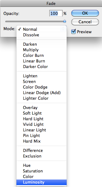
We said above that some colour shifts may occur in RGB colour space using this method - here's how we counteract that: under the edit menu go to Fade Unsharp Mask.... This will bring up a pop-up menu - choose luminosity.
Note that you can only use the fade function of any filter directly after you apply it!!! If you forget and go back to do it later, that option will be greyed out....
And now here's how my layers palette looks:
 Final thoughts and a few more examples:
There's a really great tutorial here if you'd like to take it further with a little bit of lens blur and film grain - I've found personally that some images look great with those extras and others...not so much.... It's still a great tutorial and a cool image that he's working on though and looks great in the end.
Also check out this set from Christine's 70's party.
Links to other good tutorials:
- from "Post Production Pie" SLR Lounge you can check out this tutorial that I just linked above in 2 parts.
- Ashley is a certified Adobe expert and has a lomo tutorial here and a cross-processing tutorial here. Both worth the watch in addition to some other really great tutorials there.
- here's another way to do it from Photoshop Girl (using LAB sharpening!)
And now a little more Cuba:

 |
| SOOC |

 |
| SOOC |

 |
| SOOC |

 |
| SOOC |
Oops! Have I missed something?! Help share resources by adding them with a short description in the comments section or write me and I'll make sure it gets posted!
4 comments:
Great tutorial. Thanks for showing us the before and after. It really helps me see what sort of image works best to start off with. I'm always looking forward to your next post!
One of the most comprehensive cross-processing tutorials:) Nice job :)
Appreciate the kind words - thanks guys!
shayne gray learns photography
thanks for this sir. :) Please keep on blogging
Post a Comment